测试:修订间差异
来自SOKA CAFE
小 |
小 |
||
| 第16行: | 第16行: | ||
</div> | </div> | ||
</div> | </div> | ||
| 第37行: | 第36行: | ||
body { | body { | ||
background: #f5f5f5; | background: #f5f5f5; | ||
padding: 20px 0; | |||
} | |||
.header-container { | |||
width: 100%; | |||
padding: 0 20px; | |||
margin-bottom: 20px; | |||
} | |||
.carousel-section { | |||
width: 100%; | |||
display: flex; | |||
justify-content: flex-start; /* 强制在最左 */ | |||
padding-left: 0; | |||
} | } | ||
.container { | .container { | ||
background: transparent; /* 无背景 */ | |||
border-radius: 4px; /* 圆角度4px */ | |||
padding: 0; | |||
box-shadow: none; | |||
overflow: hidden; | |||
margin: 0; | |||
} | |||
/* 电脑端 - 全屏三分之一 */ | |||
padding: | @media (min-width: 1025px) { | ||
.container { | |||
width: calc(100vw / 3); /* 全屏的三分之一 */ | |||
max-width: none; | |||
min-width: auto; | |||
aspect-ratio: 2.03; | |||
margin-right: auto; | |||
} | |||
.header-container { | |||
padding-left: calc(100vw / 3 + 40px); /* 标题与轮播图对齐 */ | |||
} | |||
} | |||
/* 平板端 - 全屏三分之一 */ | |||
@media (min-width: 769px) and (max-width: 1024px) { | |||
.container { | |||
width: calc(100vw / 3); /* 全屏的三分之一 */ | |||
max-width: none; | |||
min-width: auto; | |||
aspect-ratio: 2.03; | |||
margin-right: auto; | |||
} | |||
.header-container { | |||
padding-left: calc(100vw / 3 + 30px); | |||
} | |||
} | |||
/* 手机端 - 保持原有大小 */ | |||
@media (max-width: 768px) { | |||
.container { | |||
width: 92vw; | |||
max-width: 500px; | |||
aspect-ratio: 2.03; | |||
margin: 15px auto; | |||
} | |||
.carousel-section { | |||
justify-content: center; | |||
} | |||
.header-container { | |||
padding-left: 0; | |||
text-align: center; | |||
} | |||
} | |||
/* 小手机设备 */ | |||
@media (max-width: 480px) { | |||
.container { | |||
width: 94vw; | |||
min-width: 260px; | |||
aspect-ratio: 2.03; | |||
margin: 10px auto; | |||
} | |||
} | } | ||
| 第61行: | 第125行: | ||
width: 100%; | width: 100%; | ||
height: 100%; | height: 100%; | ||
border-radius: | border-radius: 4px; | ||
overflow: hidden; | overflow: hidden; | ||
} | } | ||
| 第87行: | 第151行: | ||
width: 100%; | width: 100%; | ||
height: 100%; | height: 100%; | ||
object-fit: cover; | object-fit: cover; | ||
object-position: center; | object-position: center; | ||
display: block; | |||
} | } | ||
| 第95行: | 第160行: | ||
top: 50%; | top: 50%; | ||
transform: translateY(-50%); | transform: translateY(-50%); | ||
width: | width: 36px; | ||
height: | height: 36px; | ||
background: rgba(0,0,0,0. | background: rgba(0,0,0,0.4); | ||
color: #fff; | color: #fff; | ||
border: none; | border: none; | ||
border-radius: 50%; | border-radius: 50%; | ||
font-size: | font-size: 18px; | ||
cursor: pointer; | cursor: pointer; | ||
z-index: 10; | z-index: 10; | ||
| 第107行: | 第172行: | ||
align-items: center; | align-items: center; | ||
justify-content: center; | justify-content: center; | ||
transition: background | transition: background 0.3s; | ||
} | } | ||
.carousel-btn:hover { | .carousel-btn:hover { | ||
background: rgba(0,0,0,0.6); | background: rgba(0,0,0,0.6); | ||
} | } | ||
.prev-btn { | .prev-btn { | ||
left: | left: 12px; | ||
} | } | ||
.next-btn { | .next-btn { | ||
right: | right: 12px; | ||
} | } | ||
.carousel-indicators { | .carousel-indicators { | ||
position: absolute; | position: absolute; | ||
bottom: | bottom: 15px; | ||
left: 50%; | left: 50%; | ||
transform: translateX(-50%); | transform: translateX(-50%); | ||
display: flex; | display: flex; | ||
gap: | gap: 8px; | ||
} | } | ||
.indicator { | .indicator { | ||
width: | width: 10px; | ||
height: | height: 10px; | ||
border-radius: 50%; | border-radius: 50%; | ||
background: rgba(255,255,255,0.5); | background: rgba(255,255,255,0.5); | ||
| 第147行: | 第210行: | ||
} | } | ||
/* | /* 平板设备按钮调整 */ | ||
@media (max-width: 1024px) { | |||
@media | |||
.carousel-btn { | .carousel-btn { | ||
width: | width: 32px; | ||
height: | height: 32px; | ||
font-size: | font-size: 16px; | ||
} | } | ||
} | } | ||
/* | /* 手机设备按钮调整 */ | ||
@media (max-width: 768px) { | @media (max-width: 768px) { | ||
.carousel-btn { | .carousel-btn { | ||
width: | width: 28px; | ||
height: | height: 28px; | ||
font-size: | font-size: 14px; | ||
opacity: 0. | opacity: 0.9; | ||
} | } | ||
.prev-btn { | .prev-btn { | ||
left: | left: 8px; | ||
} | } | ||
.next-btn { | .next-btn { | ||
right: | right: 8px; | ||
} | } | ||
.carousel-indicators { | .carousel-indicators { | ||
bottom: | bottom: 10px; | ||
} | } | ||
.indicator { | .indicator { | ||
width: | width: 8px; | ||
height: | height: 8px; | ||
} | } | ||
} | } | ||
/* | /* 小手机设备按钮调整 */ | ||
@media (max-width: 480px) { | @media (max-width: 480px) { | ||
.carousel-btn { | .carousel-btn { | ||
width: | width: 24px; | ||
height: | height: 24px; | ||
font-size: | font-size: 12px; | ||
} | } | ||
.prev-btn { | .prev-btn { | ||
left: | left: 5px; | ||
} | } | ||
.next-btn { | .next-btn { | ||
right: | right: 5px; | ||
} | } | ||
.indicator { | .indicator { | ||
width: | width: 6px; | ||
height: | height: 6px; | ||
} | } | ||
} | } | ||
/* | /* 标题样式 */ | ||
. | .main-title { | ||
font-size: min(4vw, 26px); | |||
margin-top: 20px; | |||
text-align: left; | |||
font-family: serif; | |||
padding: 0 10px; | |||
color: #333; | |||
} | |||
.sub-title { | |||
font-size: min(3vw, 18px); | |||
margin-bottom: 15px; | |||
text-align: left; | |||
margin-top: 10px; | |||
padding: 0 10px; | |||
color: #666; | |||
} | |||
@media (max-width: 768px) { | |||
.main-title, .sub-title { | |||
text-align: center; | |||
} | |||
} | } | ||
</style> | </style> | ||
</head> | </head> | ||
<body> | <body> | ||
<div class="container"> | <div class="carousel-section"> | ||
<div class="container"> | |||
<div class="carousel" id="carousel"> | |||
<div class="carousel-wrapper" id="carouselWrapper"> | |||
<div class="carousel-item"> | |||
<a href="https://soka.cafe/index.php?title=创学" class="carousel-link"> | |||
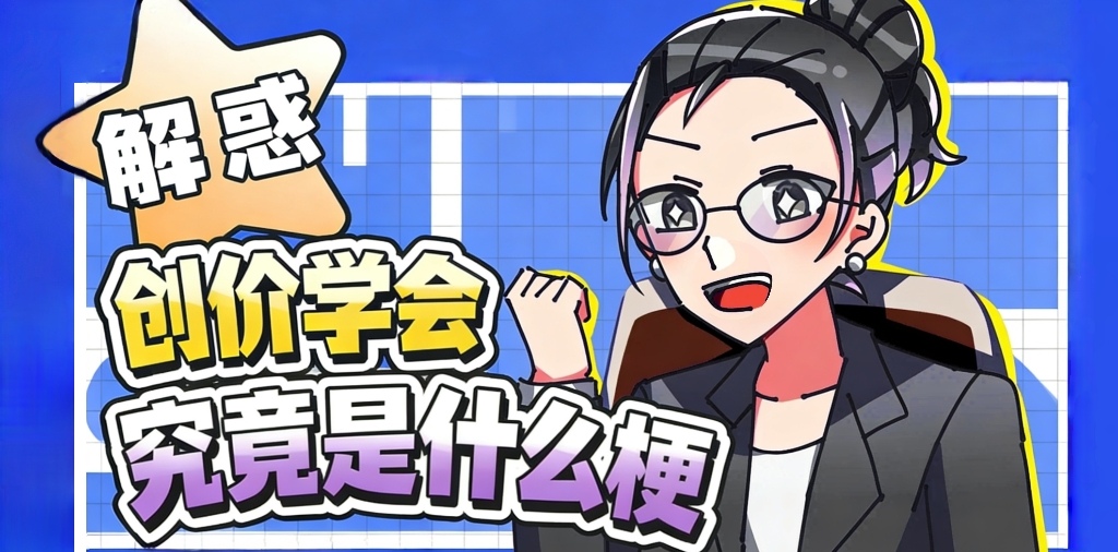
<img src="https://soka.cafe/Special:FilePath/解惑.jpg" alt="解惑"> | |||
</a> | |||
</div> | |||
<div class="carousel-item"> | |||
<a href="https://soka.cafe/index.php?title=维基观看与使用指南" class="carousel-link"> | |||
<img src="https://soka.cafe/Special:FilePath/导航1.1.jpg" alt="维基观看与使用指南"> | |||
</a> | |||
</div> | |||
<div class="carousel-item"> | |||
<a href="https://soka.cafe/index.php?title=入站须知" class="carousel-link"> | |||
</ | <img src="https://soka.cafe/Special:FilePath/条责.jpg" alt="入站须知"> | ||
</a> | |||
</div> | |||
</div> | </div> | ||
<button class="carousel-btn prev-btn" id="prevBtn"><</button> | |||
<button class="carousel-btn next-btn" id="nextBtn">></button> | |||
<div class="carousel-indicators" id="indicators"></div> | |||
</div> | </div> | ||
</div> | </div> | ||
</div> | </div> | ||
| 第346行: | 第394行: | ||
// 窗口大小变化时重新计算 | // 窗口大小变化时重新计算 | ||
window.addEventListener("resize", () => { | window.addEventListener("resize", () => { | ||
goToSlide(currentIndex); | goToSlide(currentIndex); | ||
}); | }); | ||

2026年1月27日 (二) 17:43的版本
欢迎来到「SOKA CAFE——エア本中文维基」
頭がパーン@wiki:中華エア本支部


Archive
📚 资料与档案

Creation
🪶 二创与设定

Schedule
🗓︎ 日程参照


2026年06月18日|10:17, 周四

· 6月09日 ·

· 6月13日 ·

· 6月28日 ·

Create
💻 创建页面
感谢您对SOKA CAFE的编辑贡献!但也请在过程中务必依照创作协议及版权,遵循CC BY-SA 3.0协议!
准备好了?来尝试创建页面吧!

Notice
⚠️ 入站须知
Soka Cafe一直是一个合作性、公益性的网站,我们致力于营造和谐的社区环境,并热情地欢迎任何人参与我们之间的创作,不论您的信仰、外表、地域.... 为了打造一个和谐的、无骚扰的社区环境,请通读入站须知,了解网站的性质及规则。
Plan
📄 任务计划
Soka Cafe的基本底层已大体完确! 现在的最紧要的人物是登场作品分区的规范及完成度!这对创学新人入坑的帮助极其重要! 没有相关技术不要紧,请使用“可视化编辑器”来进行编辑!如果有任何技术问题请在页面下方获取我们的联系方式!
Website
🛜 友情站点
日本创价学会Wiki
旧创价学会中文维基
亚文化维基
Cookie☆Wiki
新哲学维基
旧哲学维基
潮学维基
中文音MAD维基
OTOMAD Libraries
Aira软件库
HUIJIA FUN - Plurimod学生会官方站点
Contact
📞 联系我们
本站点以八叶莲华会社的名义设立,我们是中华阵营活跃的最大创价学会二创主题团体,欢迎各位对音MAD或AIR本文化感兴趣的各位加入我们团体!
八叶莲华会社QQ群聊:3681760584
八叶莲华会社QQ频道
八叶莲华会社Discord频道
前创价中文维基 群聊:1150098641
创价学会资源QQ群:256770365
